Moody's oneView
Client
Moody's Corporation
Services
UX Design, Prototyping
Timeline
6 months
Year
2023
Project Overview
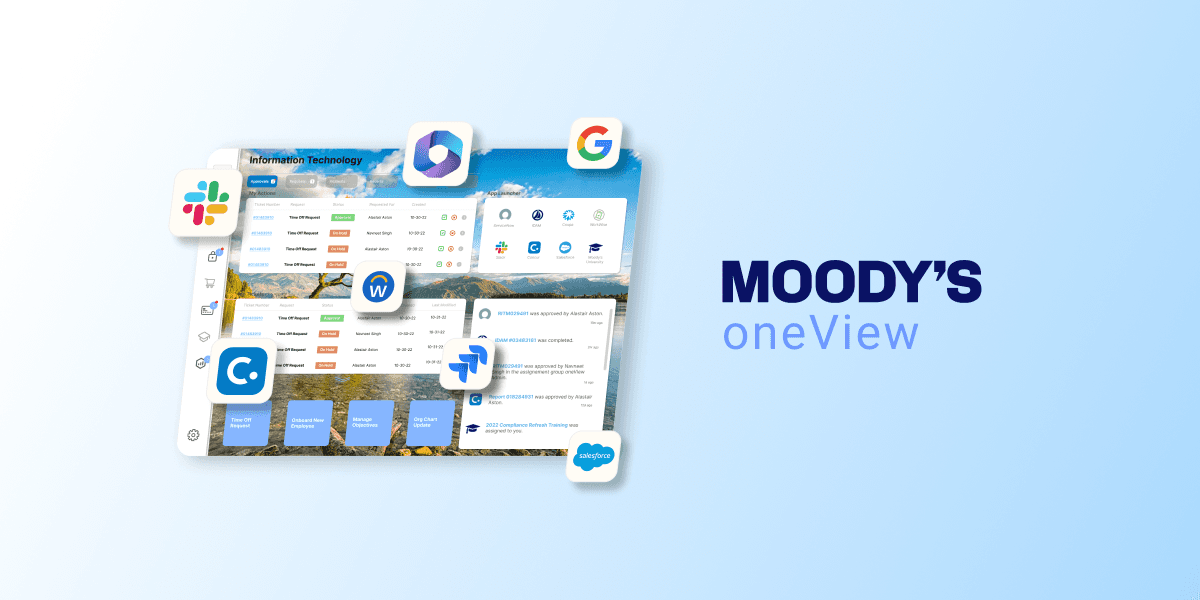
oneView is a centralized productivity tool designed within Moody’s internal startup incubator. It was built to help employees manage and act on tickets, approvals, and tasks across a wide array of enterprise systems — including ServiceNow, SalesForce, Workday, and others. The tool consolidates critical actions from these platforms into a single, streamlined interface, allowing users to stay on top of their workflows without bouncing between tools. I led the end-to-end UX process, from research and early wireframes to high-fidelity design and testing, iterating closely with both end users and system stakeholders to create an intuitive and scalable product.
Motivation
Like many large organizations, Moody’s was dealing with a fragmented ecosystem of SaaS tools. Employees were constantly switching contexts — logging into multiple platforms, juggling inbox notifications, and trying to stay on top of approvals, tickets, and status updates. This not only led to wasted time but also created operational blind spots as requests fell through the cracks.
Our challenge was to reduce this noise. We set out to build a tool that could surface the most critical information across systems in one unified view — improving visibility, streamlining approvals, and helping teams focus on the work that mattered most. The result was oneView: a modular, extensible platform designed to simplify workflows, reduce friction, and save the organization time and money.
Research
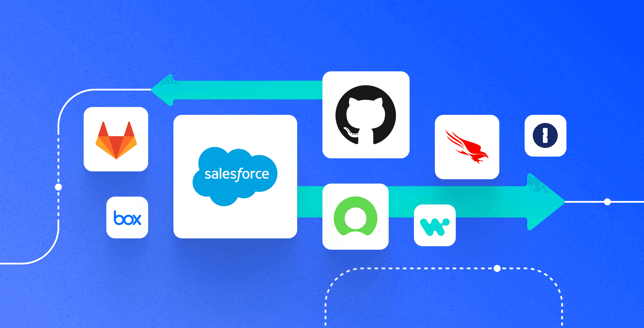
At Moody’s internal startup incubator, we were approached with a familiar challenge: too many systems, too many notifications, and too little time. Employees were juggling approvals and tickets across a sprawling landscape of platforms — ServiceNow, Workday, SalesForce, Concur, and more — each with its own alerts and UI. Our goal was to streamline this chaos. To start, we needed to understand exactly who was most affected and how.
We dug into raw usage data from systems like SalesForce and ServiceNow to identify our most active users. It quickly became clear that our power users were typically middle-to-senior managers in technical functions, often with 8+ direct reports and over 20 open tickets at any given time. We interviewed these users to dig deeper into their workflows and frustrations. Their main request was simple: a single, efficient place to review and act on tickets without needing reminders from direct reports — or bouncing between platforms.
However, our users weren’t just the people clicking the buttons. Product owners of the source systems — like those managing ServiceNow and SalesForce — also had a stake in how we presented their data. Their concerns centered on integration, data integrity, and alignment with their own roadmaps. This dual audience meant our design had to serve both usability and backend consistency from the beginning.
Ideation
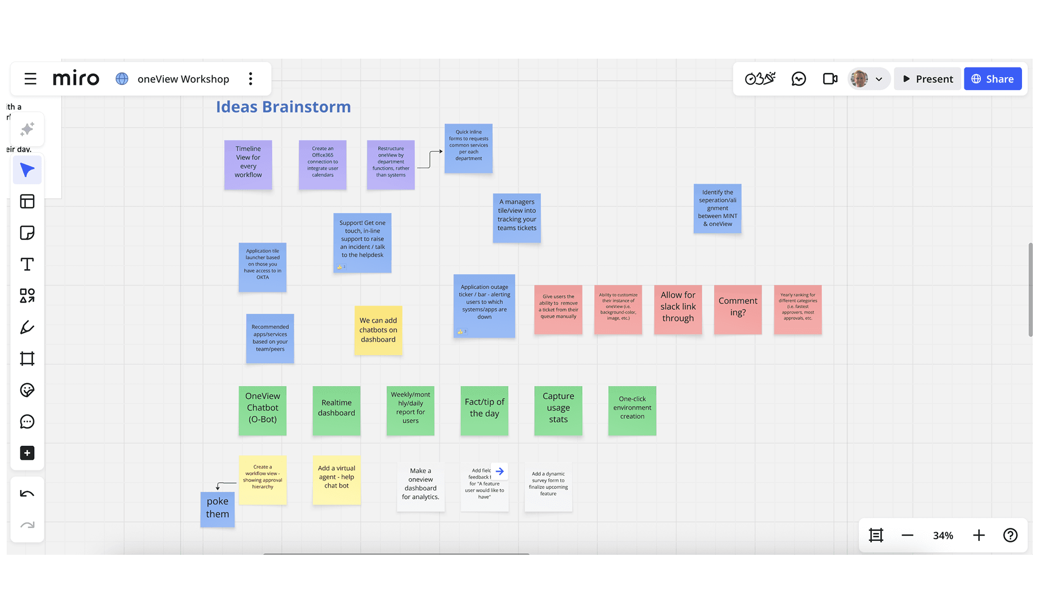
The concept that emerged was “oneView” — a unified, streamlined interface that would act as a single pane of glass into a user’s pending approvals and ticket history. But our first design iterations tried to do too much, all at once. The earliest prototype crammed every system into a single, scroll-heavy dashboard. Information was buried, the interface was dense and unreadable, and there was no way to prioritize what mattered most. There was no hierarchy, no clear calls to action, and certainly no scalability.
Realizing this approach was overwhelming, we returned to the central idea: oneView needed to reduce complexity, not visualize it. We rethought our structure and leaned into simplicity and modularity. Instead of displaying every system at once, we explored layouts that presented one system at a time, with intuitive toggles between “Actions” (items assigned to the user) and “Tickets” (items they had submitted). We began to experiment with cleaner navigation, in-context interactions, and content hierarchy that aligned with our users’ mental models.
Prototyping
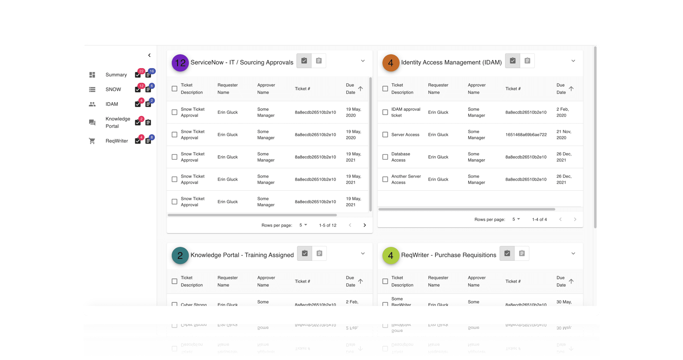
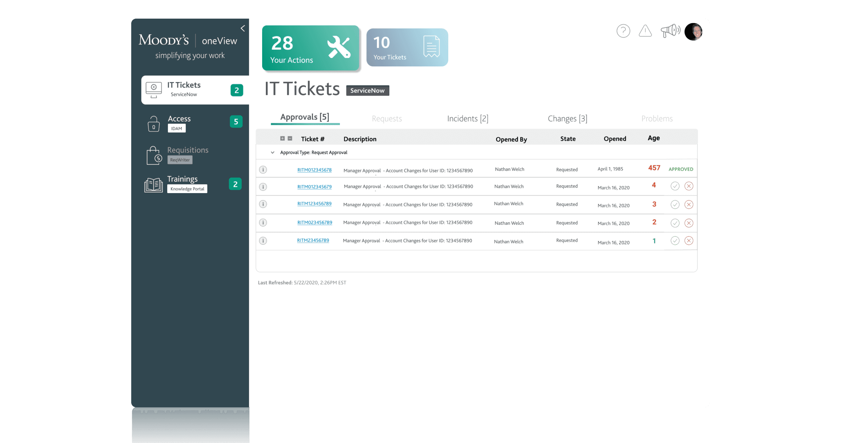
Our refined prototypes began to take shape around the feedback and insights we’d gathered. Each system grid was simplified and presented one at a time to reduce overload. Users could easily toggle between Actions and Tickets at the top of the page, and new calls to action were introduced in the form of contextual buttons and modals. Ticket numbers became hyperlinks to their source systems, and actions like approving or rejecting requests could now be completed directly within oneView.
When a ticket was rejected, users were prompted to enter a business justification, which would then be passed back to the originating system. This small but thoughtful interaction made the workflow feel complete and connected, and it was well received in early feedback. Our UI was also designed with flexibility in mind: dynamic resizing, content prioritization, and modal-driven detail views helped us maintain readability across screen sizes — a key requirement as usage expanded across desktop, tablet, and mobile.
Testing & Iteration
To test our designs, we returned to the “power users” identified early in the research phase. These individuals became our early adopters and advocates. They were given access to major features 2–4 weeks ahead of the wider rollout, and we collected their feedback through surveys, focus groups, and one-on-one interviews. This test group wasn’t just helpful for usability insights — they became champions for the tool, helping drive broader adoption across their teams.
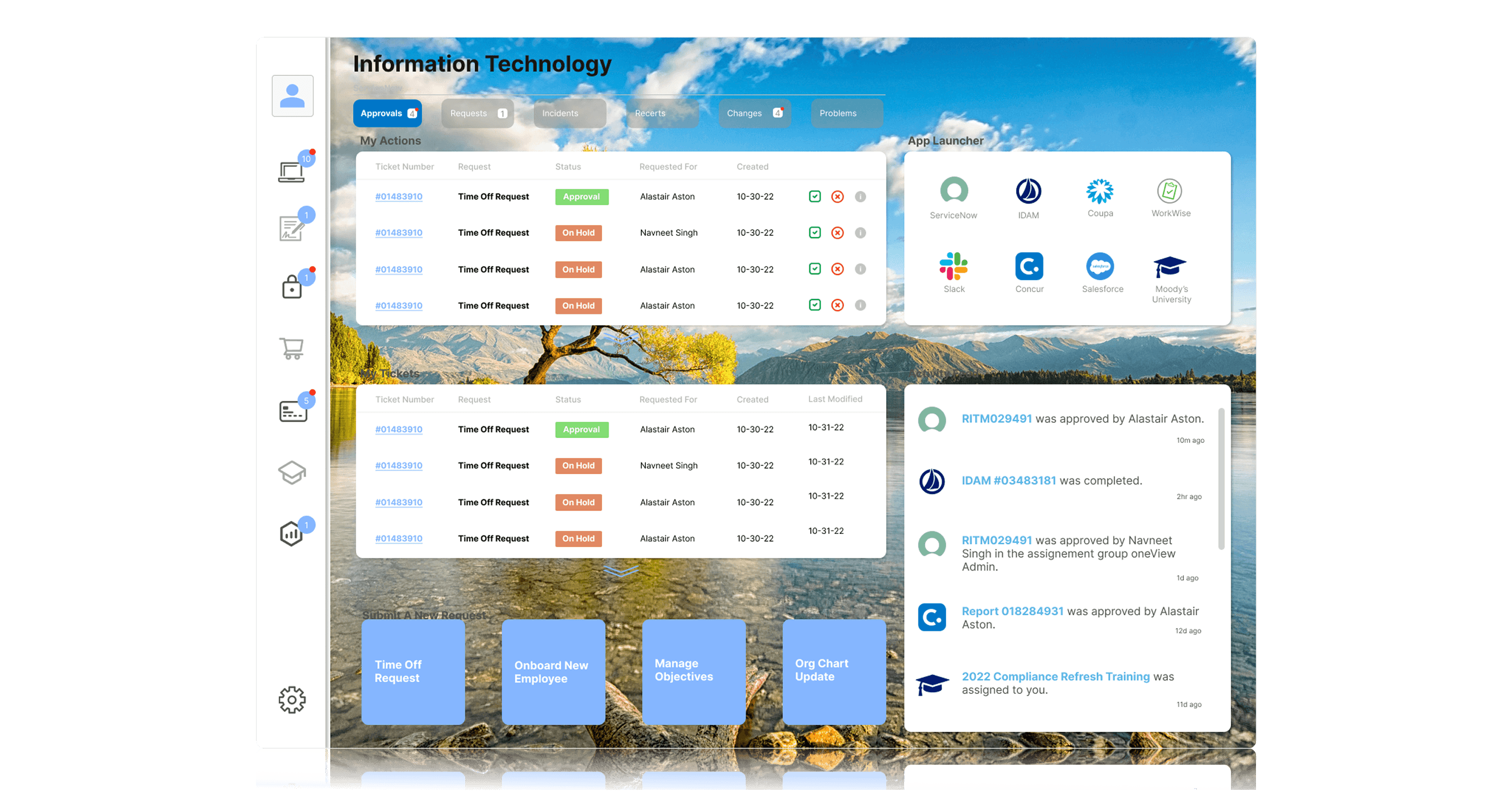
One major insight from testing was that users weren’t thinking in terms of systems — they were thinking in terms of functions. In response, we reorganized oneView’s architecture around corporate functions like IT, HR, and Finance, rather than individual platforms. Under each section, users could access their relevant actions, recent activity, and quick links — all contextualized to the tasks they were trying to accomplish. Features like personalized quick actions, recent activity feeds, and knowledge article access made the experience more comprehensive without sacrificing simplicity.
We also extended oneView’s functionality into Slack. A lightweight Slack app allowed users to receive notifications and approve or reject tickets directly within their workflow — including on mobile. While the visual design used Slack’s existing UI components, we carefully designed the notification cadence, interaction flow, and content presentation to make the experience feel both seamless and helpful.
Results & Takeaways
After launching oneView, we used a mix of hard metrics and qualitative feedback to measure success. The clearest metric came from comparing ticket closure times: tickets actioned through oneView closed three times faster than those handled in their source systems. Across the organization, this translated to more than 15,000 productivity hours saved annually, or about $900,000 in value per year. We supplemented this with NPS prompts and CSAT scores, both of which saw improvement following each major enhancement.
There were also several key lessons. First, don’t design for everything. In a product like oneView that sits on top of many other tools, we were constantly fielding enhancement requests from different system owners and stakeholders. At first, we tried to accommodate all of them — but it quickly muddled the product vision. We eventually implemented strict prioritization criteria and kept our designs grounded in user data, which helped us stay focused.
Second, user conversations are a powerful compass. Whenever we hit a crossroads in design, revisiting interviews with our core users would often point us in the right direction. And finally, defining measurable success criteria from the beginning is crucial. We didn’t do this early on, and it made it difficult to prove the tool’s value until we retroactively captured the data. Moving forward, this became a foundational practice for every feature we shipped.