FDNY Foundation
Client
Fire Department of New York
Services
UX Research, Web Design, Mobile Design
Timeline
2 Months
Year
2022
Project Overview
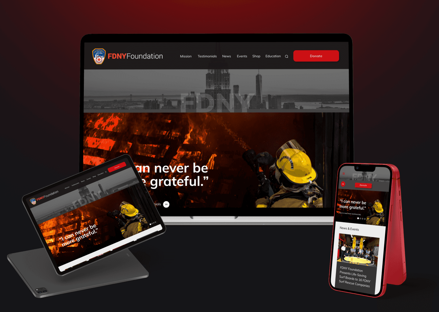
I've redesigned the FDNYfoundation.org website. The website serves several functions: providing information about FDNY initiatives & outreach, collecting donations for the org, and an FDNY shop. I've updated these elements to give them a usable and fresh feel in addition to implementing a responsive redesign, optimizing the new site for desktop, tablet, and mobile.
Motivation
The FDNY site has immense potential for real-world impact. It offers fire safety education for children, provides outreach and aid for 9/11 survivors, and facilitates donations which translate directly to lives saved by the FDNY’s day-to-day activities. However, many of these functions' digital features feel outdated and disjointed in their current form. Since the FDNY is one of the most recognizable nonprofit brands in the country, they should have a site that matches their world-class reputation.
Research
Because the existing website had no clear call to action, the primary goal of my research plan was to discover who a target user of the FDNY would be and how they would use foundation's website. I started broadly by investigating how people view their local fire departments in general - not just the FDNY brand - and in what ways they may want to engage with them.
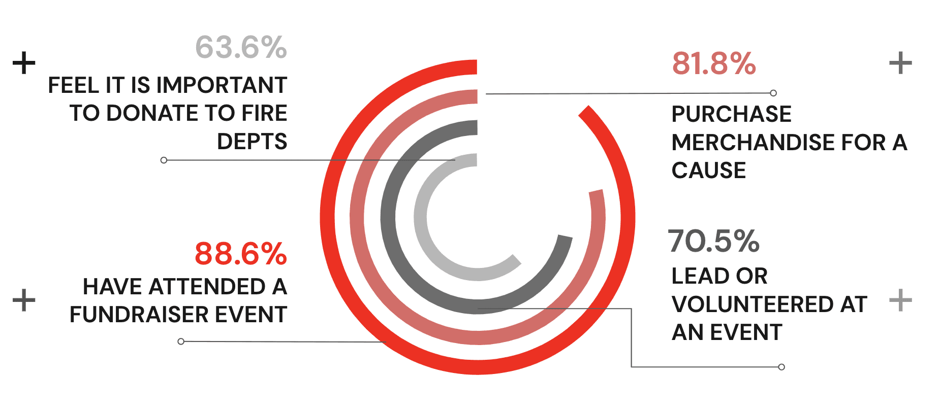
I interviewed and surveyed a combination of community members and active volunteer firefighters. The results revealed two key takeaways: the majority of people believe it is important to donate to their local fire departments and most people have either attended or volunteered for a charity event.
While I did not get a chance to interview current FDNY firefighters, I did have conversations with several active firefighters from other departments. They confirmed in the world of firefighting, paid firefighting positions are extremely coveted over volunteer positions. Furthermore, the FDNY is the most prestigious organization among paid departments. The competitive nature of FDNY firefighter hiring told me a focus on the site's recruitment features would note generate the most value for the foundation.
Instead, the willingness of community members to support their local fire departments suggests the site should highlight revenue-generating functionality like the Donate screen and the Shop.
2. Ideation
To begin ideating, I conducted an evaluation of similar websites like those of the California State Fire Department, the NYPD, and other nonprofits. Based on these, I compiled a list of potential features for the new site using an 'I Like, I Wish, What If' analysis.
One aspect that stood out on these other sites was their ability to elicit empathy through powerful imagery and testimonials. I believed invoking a similar tone on the FDNY website would be critical to drive users to engage with features I wanted to highlight.
Next, I used Miro to map out three key user workflows: viewing and submitting testimonials, donating to the foundation, and purchasing something from the shop. Mapping out each step in these processes directly translated into the necessary screens and interactions I would need to prototype.
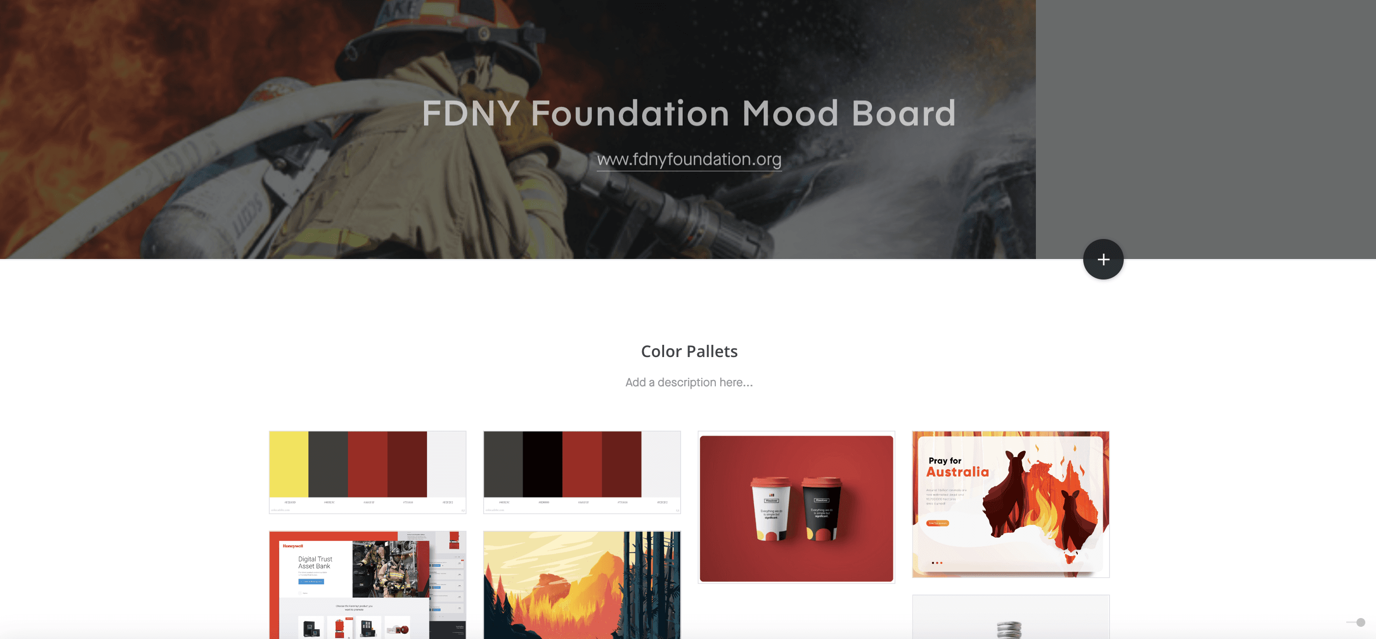
I rounded out the Ideation phase but establishing a mood board, pictured above. I curated a grouping of bold color schemes, imagery, and fonts that would emphasize the FDNY's lifesaving activities.
3. Prototyping
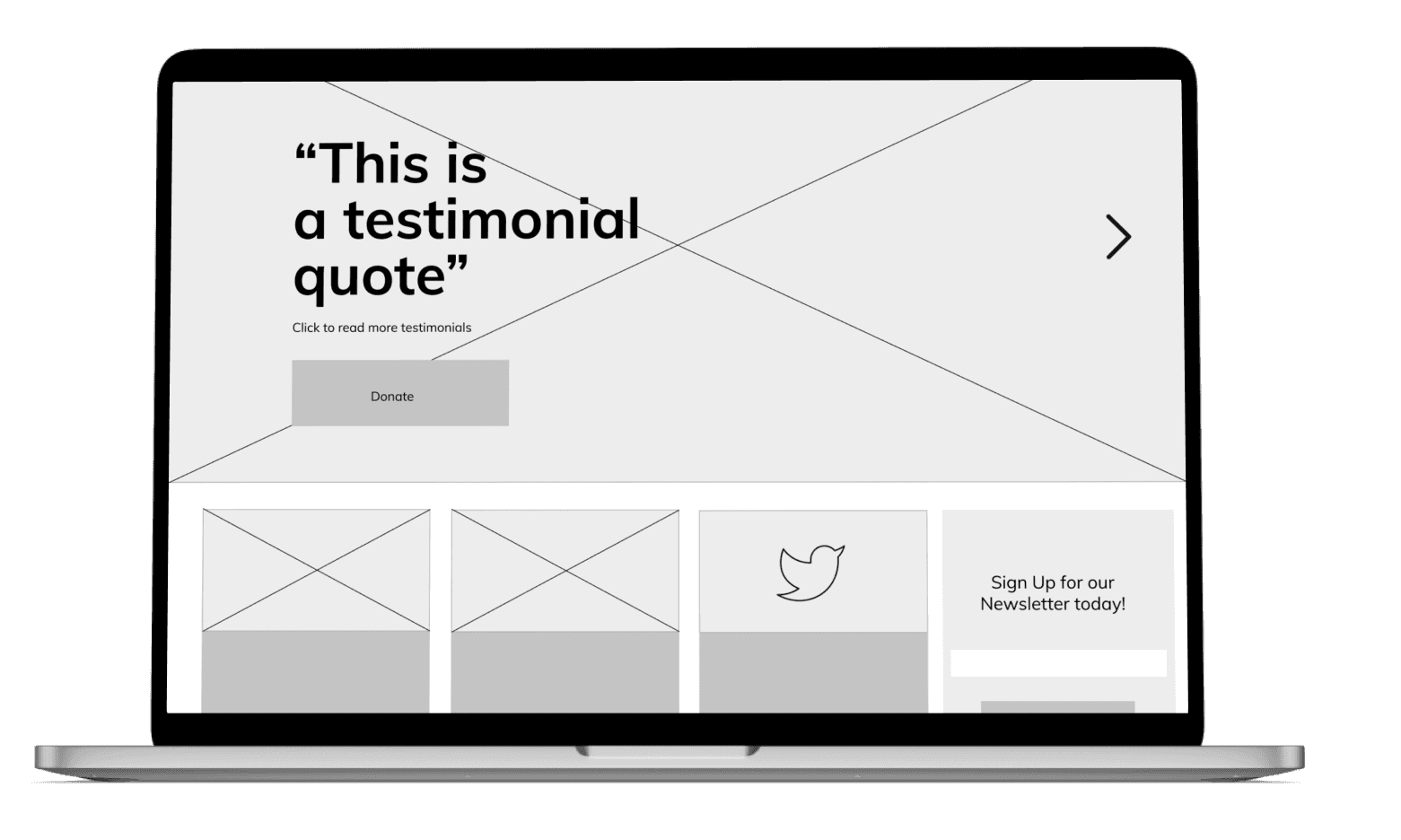
Using the workflows I had previously defined, I began by creating a low-fidelity prototype. This mockup included the base home screen, a testimonials page, a shop, a donation page and intermediary screens to facilitate the users interactions.
4. Testing & Iteration
Once my low-fidelity prototype was complete, I conducted several usability tests. I was able to make a number of improvements as I transitioned to a high-fidelity prototype by observing user behavior and collecting their feedback.
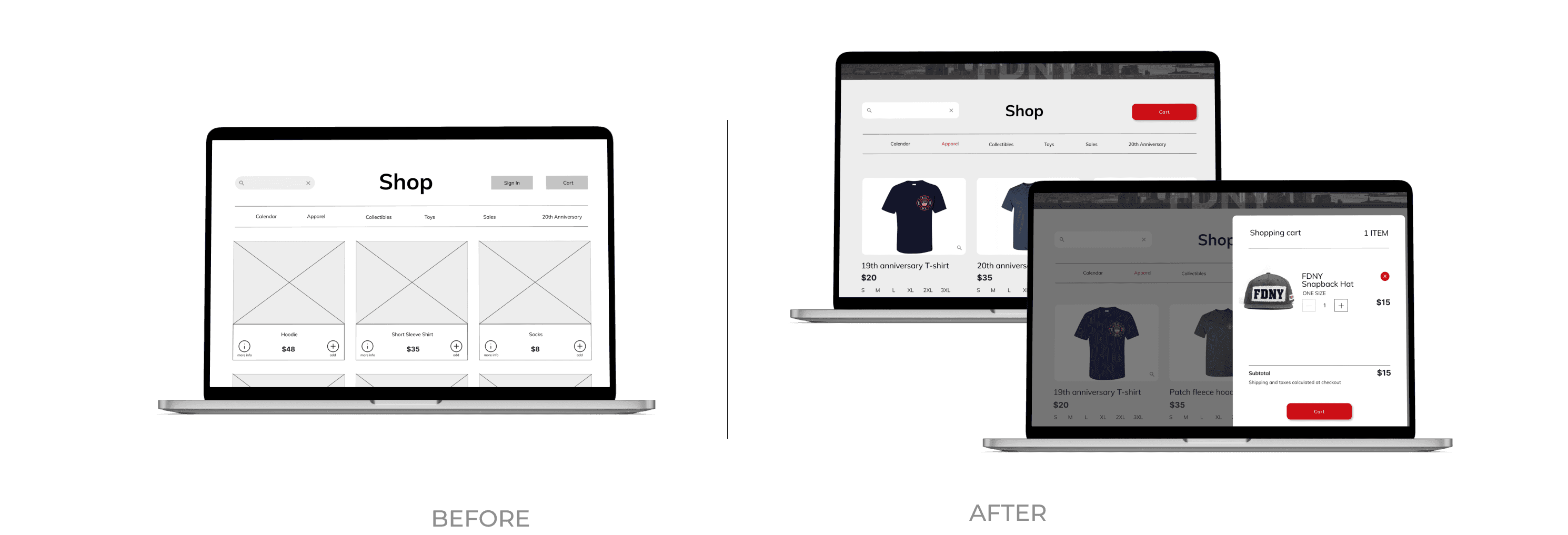
For example, the site includes several forms across the Donation and Shop features which users identified as inconsistent with each other. By standardizing their UI and language, I was able to create a more cohesive experience.
Additionally, the Shop feature, though intentionally simple, lacked many standard functionalities users have come to expect from ecommerce experiences like Amazon. By collecting users' recommendations and studying other best-in-class online shopping sites, I was able to drastically improve the usability of the FDNY Shop.
5. Results & Takeaways
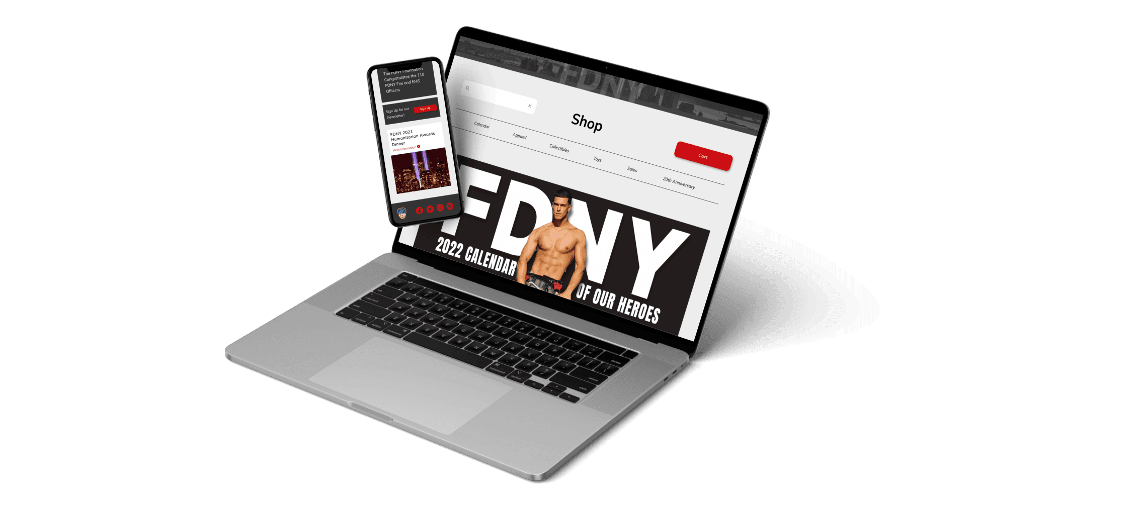
I finalized the FDNY Foundation redesign by ensuring its responsiveness with high-fidelity mobile and tablet screen iterations. As an immediate next step, I would like to fully complete all site pages with mobile and tablet responsiveness. Once complete, I will look to reach back out to the FDNY to see if I can get feedback directly from the customer.
Among many other takeaways, I believe this project was an excellent demonstration of the importance of the research phase. The features that the customer's existing site highlighted were revealed to miss the priorities highlighted by users and the larger firefighter community.